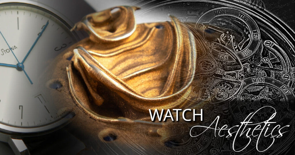
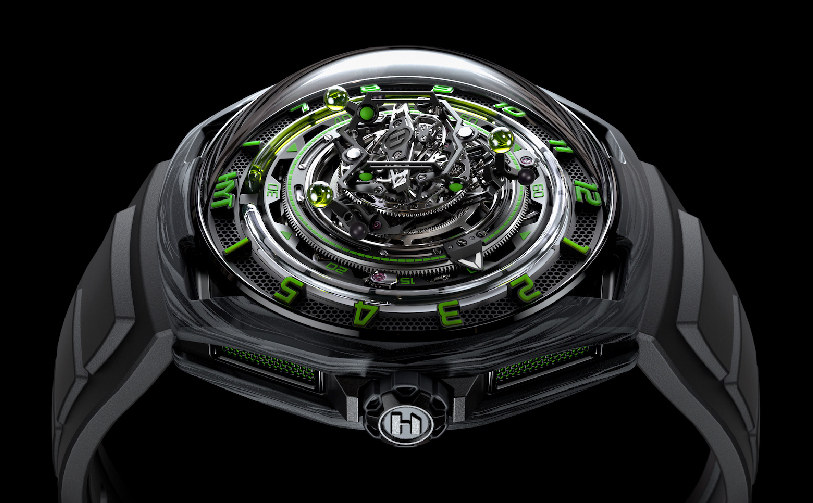
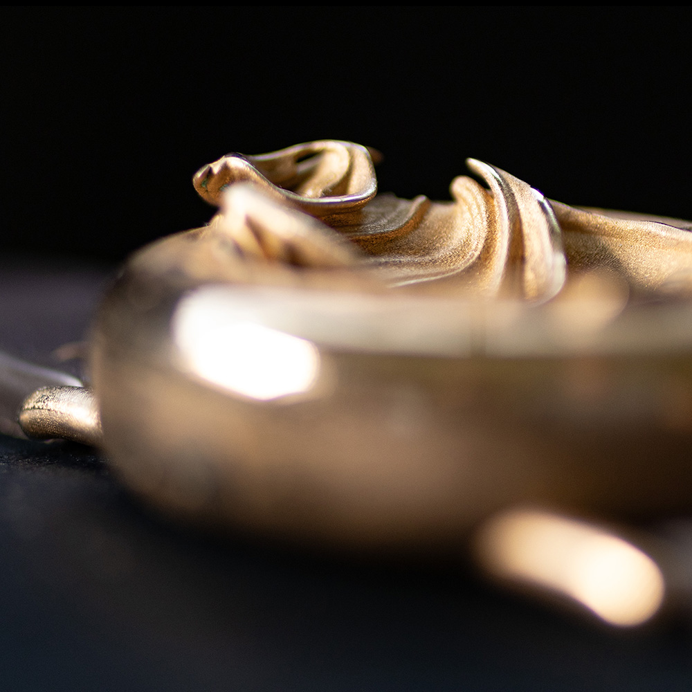
The watch in the middle of the image above is our Fractal Emergence in bronze.
Sections Of This Article
- Watch aesthetics through history
- How practicalities shaped watch aesthetics
- Ways of communicating the time
- The golden ratio
- Colour in watch design
- Artistic movements that affected watch aesthetics
- Watch aesthetics now: story and concept, tradition and innovation
- Watch aesthetics breaking free from former limitations.
- Unconstrainedtime aesthetic inspirations
Introduction
This article looks at the factors influencing watch aesthetics, how timepiece history, practicalities, different types of time-displays, and other design factors led watches to look the way they do today.
I then look at the current influences on watch aesthetics, the background behind the significant broadening of design possibilities, and the aesthetic influences on our own unusually unique timepiece creations.
As usual in my articles, I look more deeply than is common, including little-known and sometimes controversial perspectives. This article needs to be understood as a whole for a balanced perspective since reading one section as if it exists in isolation can lead to misleading interpretations.
Watch Aesthetics Through History
Early portable ‘clock‑watches’, often called Nuremberg eggs due to their shape and origin in Nuremberg, 16th‑century Germany, were really more like portable clocks, and had repeating patterns of baroque ornamentation:
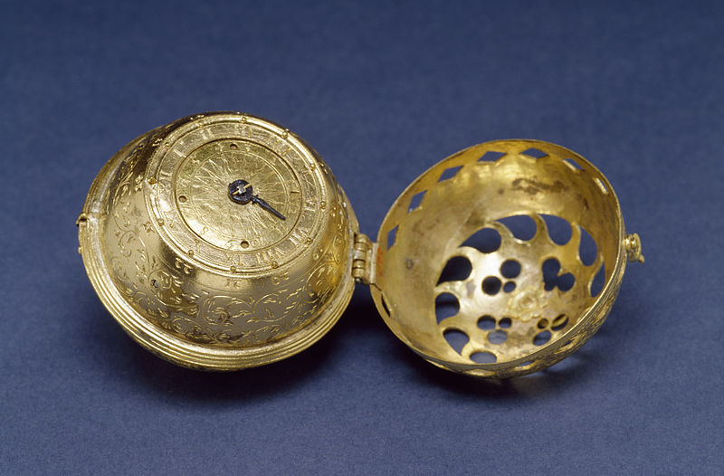
Some had three feet so could be stood on a table, as well as having a ring on top so they could be worn around the neck or on the wrist. Other watches of the period were drum-shaped and could be carried in a purse.
Watches were initially created for practical timekeeping purposes, and their designs were often driven by functionality (although added decorations were common). Early watches needed to be as portable as possible (although they seem large by modern standards) and easily readable, leading to compact and legible designs.
Because watches were not very accurate initially, early examples only had an hour hand. The introduction of the minute hand on watches is attributed to increased demand for improved timekeeping precision, and began by about 1680.
Here is a watch by Daniel Quare (one of several English clockmakers active during the period when the minute hand became standard), who included a minute hand in his watches from the 1690s
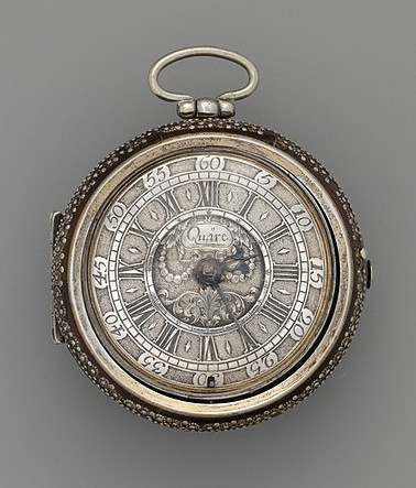
Quare is known for his innovations in watchmaking, including the creation of repeating watches and improved escapements.
By the 18th century, watches with both hour and minute hands became more common. This evolution was driven by the increasing demand for accurate timekeeping and advancements in the design and manufacturing of watch movements.
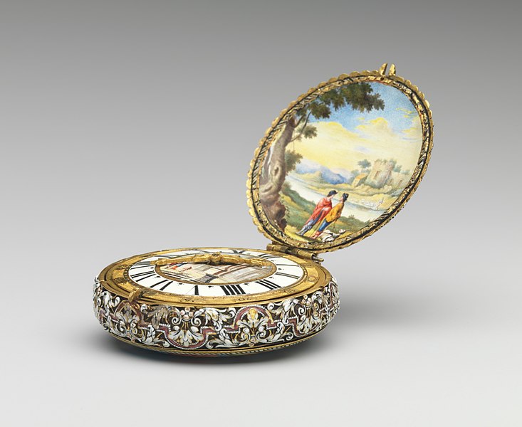
The materials available influenced the aesthetics of watches through history. Early watches were made by metalworkers and crafted using metals like brass, gold, and platinum. The craftsmanship and detailing, including engraving and decorative elements, were essential for showcasing the skill of watchmakers. Here is an example of a decorated watch from circa 1778:
Technological limitations influenced the size and shape of early watches. Mechanical components and movements had to fit within the case, which impacted the overall design. Miniaturization and advancements in horological technology over time allowed for more intricate and refined designs.
Fashion trends and cultural preferences played a role in shaping watch aesthetics. For example early wristwatches were decorative items for women, while men used larger and much more accurate pocket watches. Styles were influenced by the prevailing tastes of the time, whether it be the Baroque, Rococo, or later periods. Trends in ornamentation, colour choices, and overall design were reflective of broader stylistic movements.
Watches often served as symbols of status and wealth. Elaborate and ornate designs were used to signify luxury and exclusivity, such as this watch from the early 19th century:
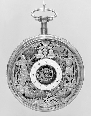
Decorative elements like gemstones, intricate engravings, and precious metals were employed to convey a sense of opulence.
The dial or face of the watch played a crucial role in the aesthetics. As watches evolved, watchmakers experimented with different dial layouts and designs. Legibility became increasingly important, especially in situations such as under water or night use (see below), leading to the development of clear and readable watch faces.
Cultural factors, including regional and societal preferences, influenced watch aesthetics. Different cultures had distinct design preferences, leading to the creation of diverse styles and variations in watches.
How Practicalities Shaped Watch Aesthetics
Portable clockwatches, pendants, and pocket watches were made using rounded shapes, so as not to catch on fabric.
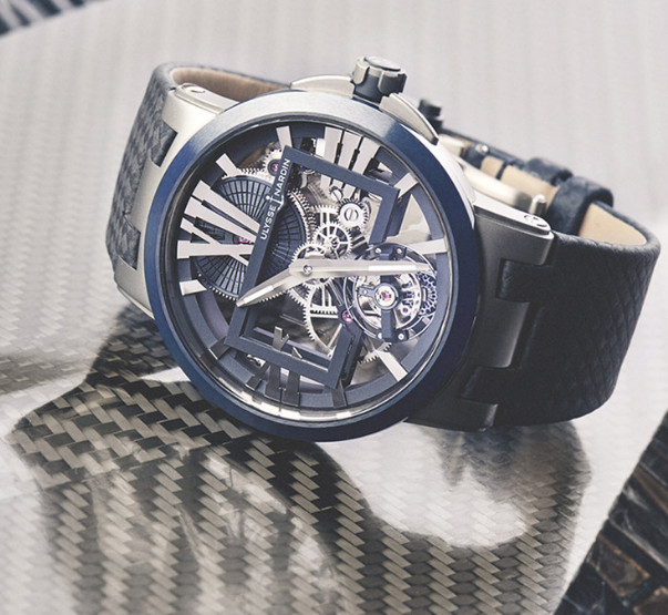
Early watches were crafted for durability, often using robust materials like brass and steel. As technology advanced, materials such as titanium and ceramic were incorporated to enhance durability while reducing weight. For example this is the Ulysse Nardin Executive Skeleton Tourbillon in blue ceramic and titanium:
Although small numbers of wristwatches were available before that time, during the first world war, pocket watches on wrist straps started being used by officers, for the accurate timing of manoeuvres like the creeping barrage. By the end of the war wristwatches were common battlefield items among officers and some ordinary soldiers, accelerating post‑war mainstream adoption after demobilized soldiers wore their wristwatches in public.
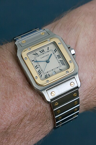
Famous aviator Alberto Santos-Dumont asked Cartier to design him a watch for use while flying his airplane, and the result, the Cartier Santos, and was one of the main watches which influenced the concepts of most wristwatches since then:
Racing drivers were another group of people who needed to check the time while using controls with their hands, influencing watch design.
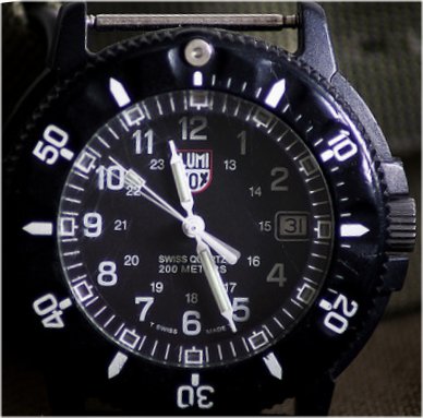
The Luminox Navy SEAL watch is the timepiece that made Luminox famous. In 1992, Nick North, a procurement officer for the U.S. Navy SEALs’ R&D division, collaborated with Luminox to produce more visible watches for night missions, finding the solution when he discovered Luminox:
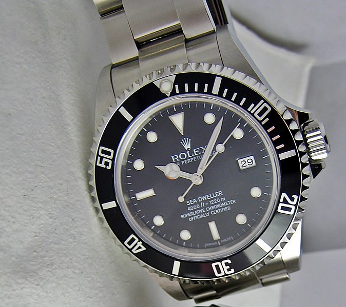
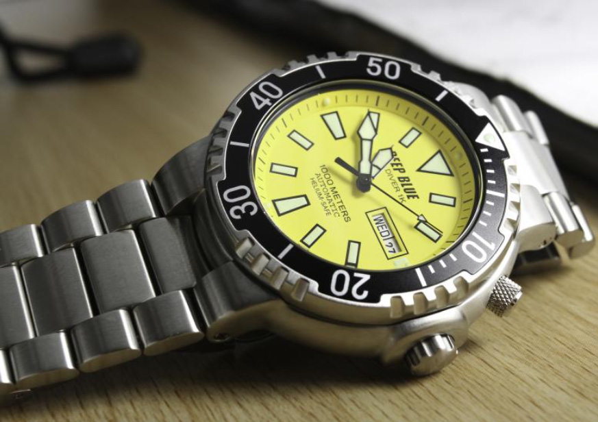
Dive watches used rotating bezels to keep track of time spent underwater. In the 1950s and 1960s, underwater diving, or Scuba diving as it became known, became very popular, making dive watches popular too. Water resistance became a crucial practical consideration, leading to the development of sealed cases and improved gaskets. Dive watches, in particular, showcase a marriage of functionality and durability, with features like screw-down crowns and helium escape valves. Rolex is, of course, famous for their diving watches:
Practicality demanded readable dials, leading to the development of clear and legible watch faces. This influenced the use of contrasting colours, high-contrast hands, and luminescent materials to ensure readability in various lighting conditions.
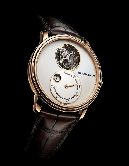
The evolution of complications (additional features beyond basic timekeeping) such as chronographs, date displays, and GMT functions was driven by the practical need for additional functionalities. This example is the Blancpain-Villeret Tourbillon Volant Heure Sautante Minute Rétrograde, which has flying tourbillon, jump hours and retrograde minutes complications:
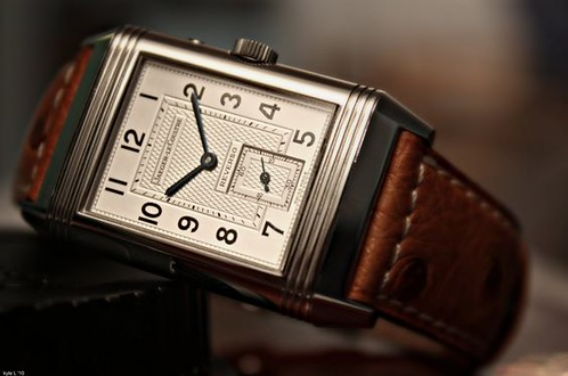
The Jaeger-LeCoultre Reverso, which could be flipped over, was designed to keep the watch face safe during polo matches:
The advent of quartz watch movements from the 1970s revolutionized watchmaking. Quartz watches, being more accurate and requiring less maintenance than mechanical counterparts, led to the design of sleek and minimalist timepieces, as well as, to some extent polarizing the watch industry between inexpensive practical watches and beautiful expensive timepieces. High‑end quartz watches with thermo‑compensated movements can dramatically exceed standard mechanical chronometer accuracy by an order of magnitude or more (e.g. ±10 s/year vs. ±5 s/day), so quartz watches definitely have a place in the higher end of watchmaking.
Advances in manufacturing techniques such as CNC machining and 3D printing have opened up new possibilities in watch design. Complex and intricate shapes, as well as novel materials, are now feasible, influencing the aesthetics of modern watches (see our own watches below).
All these practical influences have helped shape the way the majority of watches look today. Strong segments of the current watch market are driven by tool‑watch functionality and horological engineering, not just fashion alone, so concepts of aesthetics in watch design need to be seen in the context of how functional and practical considerations have had a profound influence on watchmaking throughout its history, and continue to do so to this day.
If you want to know more, you might be interested to read this section of another of my articles: From Concept to Wrist: How a New Watch is Usually Designed and Made.
Ways of Communicating the Time
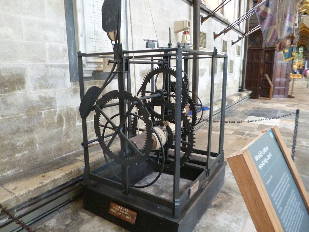
Early mechanical clocks, which appeared in European medieval monasteries in the 14th century, featured striking mechanisms ringing bells to call people to worship. The image below is of the clock in Salisbury Cathedral, made in about 1386. It is said to be the oldest clock in the world which is still working:
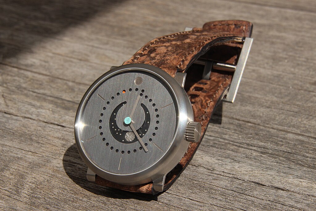
Before the current convention of time-displays using a dial and hands became the norm, various other ways of displaying the time were used. One of these is shown in a recent watch using the 17th Century idea of displaying the sun and moon, as well as illustrating other things, to show what time of day it is. Here’s the Mr. Jones Sun and Moon:


. . . which is one of my favourites from a brand where all the watches are unusual in style (with most of the others being more “quirky” illustration style of aesthetics). This watch displays the time using a unique crescent shape, with sun or moon visible, indicating daylight or night time (above), as well as the shapes of animals at the times they would appear.
Many early clocks had literal hands with a finger pointing at the time. Hands later became long shaped with a counterweight opposite the central head. One current watchmaker which does things differently is Beaubleu, whose watches have round hands.
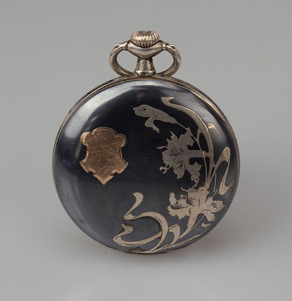
Early Clocks and watches used Roman numerals. Later Arabic numerals were used for their curves due to the influence from art movements such as Art Nouveau. The image below is an example of a watch decorated in the Art Nouveau style:
In an interesting echo of very early clocks communicating the time by sound, steam whistles started being used in the 19th and early 20th centuries, in factories, to signal important events and coordinate the activities of workers.
Steam whistles were employed as a means of signalling the beginning and end of work shifts. The loud and distinctive sound of a steam whistle could be heard over the noisy machinery, alerting workers to start or conclude their work. Steam whistles were also used to announce break times and lunch periods. The whistles helped synchronize breaks, ensuring that workers across the expansive factory floor were aware of the designated times for rest and meals, as well as signalling emergencies. Different patterns of whistles could convey specific messages to workers.
Of course, some clocks and watches continue to use sound as a means of communicating the time, from cuckoo-clocks to watches with chimes such as this Christopher Ward C1 Bel Canto:
When digital watches were invented in the 1970’s, they brought their own space-age aesthetics with them, along with their electronic numerical time-displays.
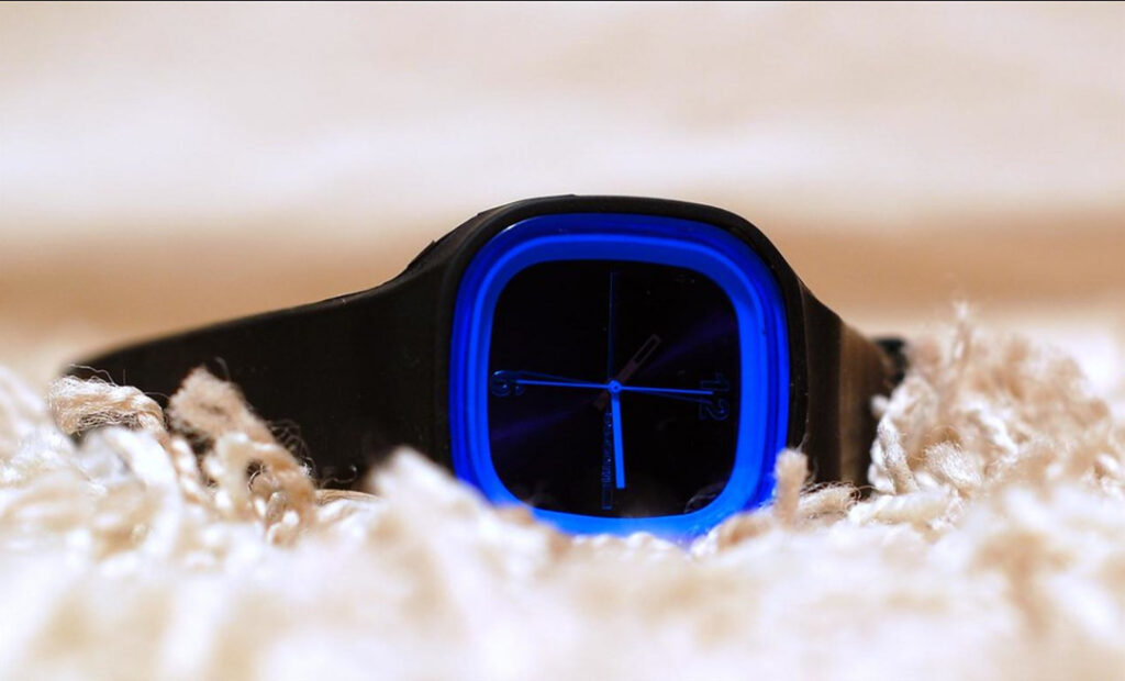
Some watches these days have alternative time displays (including our own, see below), including at least one with no visible time display at all (below).
People today want uniqueness and individuality, innovation, and/or tradition. People are now more interested than they ever have been in the artistic (such as story, concept, aesthetics etc.) rather than functional attributes of items like watches, especially since the practicality of timekeeping is no longer really necessary on a watch for most people’s daily lives, since they have the time on their smartphone. Watches are still used for practical reasons in diving, aviation, motorsports timing, and scientific/industrial timing niches, but displaying the time is now not the main function of many watches, as shown by the existence of the Haldimann H9 which has no visible time display at all:
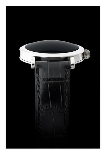
.
The Golden Ratio
The golden ratio is known for its aesthetically pleasing proportions, and some watchmakers have incorporated these principles into their designs. Here are a few examples:
Omega Constellation Globemaster:
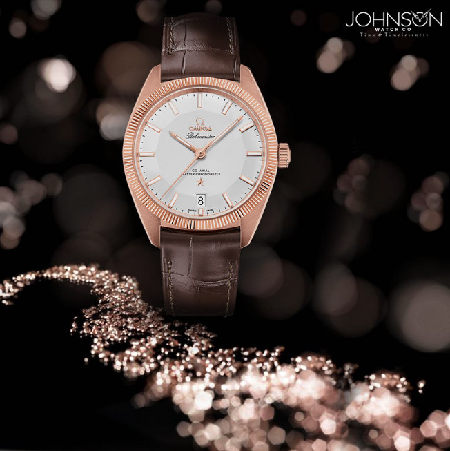
The Omega Constellation Globemaster is a modern watch that features elements inspired by the golden ratio. From the proportions of the case to the design of the pie-pan dial, Omega aimed to achieve a balanced and visually pleasing watch. The “pie-pan” dial refers to the slight upward slope resembling an inverted pie pan.
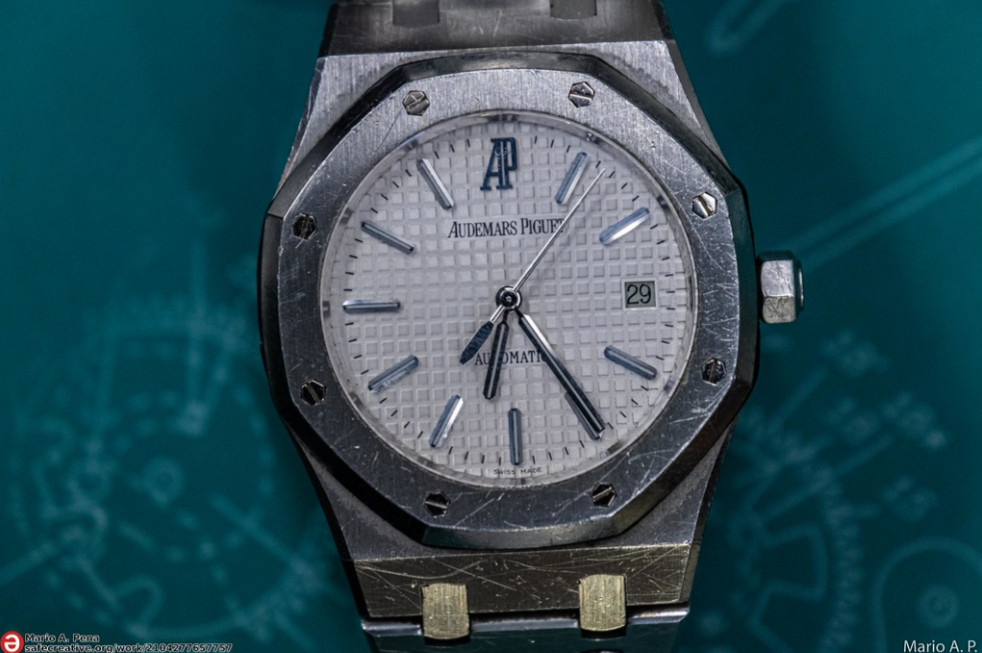
The Audemars Piguet Royal Oak, designed by Gerald Genta, is an iconic watch that has achieved a harmonious balance in its proportions. The octagonal bezel and the arrangement of the dial are believed to be influenced by the golden ratio, although these proportional resonances are often noted by enthusiasts rather than confirmed by design documentation
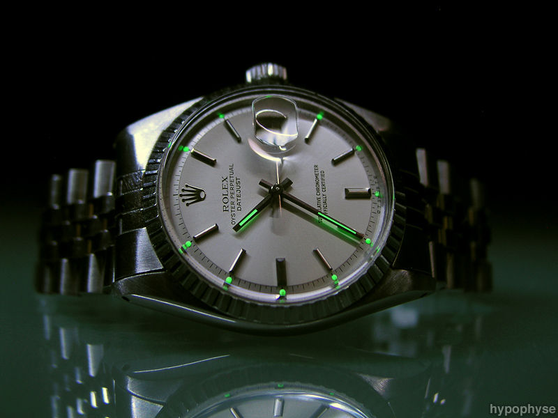
The Rolex Datejust, a timeless and versatile timepiece, is known for its balanced proportions. While Rolex has not explicitly stated the use of the golden ratio, the classic design principles employed in the Datejust align with the concept of creating visually harmonious proportions.
The Jaeger-LeCoultre Reverso, introduced in the 1930s, is celebrated for its reversible case. While the use of the golden ratio might not be explicit, the clean lines and proportions of the watch showcase a balanced and timeless design.
It’s important to note that the application of the golden ratio in watch design may vary, and in some cases, watchmakers may draw inspiration from these principles without strictly adhering to precise mathematical ratios. The examples mentioned above demonstrate how the golden ratio can be subtly integrated into watch aesthetics, such as being common in the ratio of hour to minute hands, contributing to the overall visual appeal of the timepieces.
Colour in Watch Design
Colours play a significant role in watch design, contributing to the overall aesthetics and conveying subtle messages about the timepiece. The choice of colours can evoke emotions, enhance readability, and align with fashion trends. Here’s a look at the meanings associated with different colours commonly used in watch design:
Black: Elegance and sophistication: Black is a classic colour often associated with formality and luxury, as well as power. Black watches are commonly chosen for formal occasions and black is a common colour in high-end timepieces.
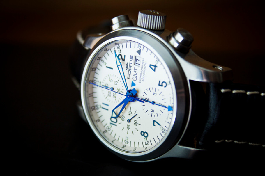
White: Cleanliness, simplicity and purity: White dials are often chosen for their legibility and understated elegance, making them suitable for both casual and dressy occasions. Here’s the Fortis 3S:
Blue: Trust, calmness, and serenity: Blue sometimes refers to nautical influences. Blue dials are versatile and can range from deep navy for a classic look to vibrant hues for a more contemporary and sporty appearance.
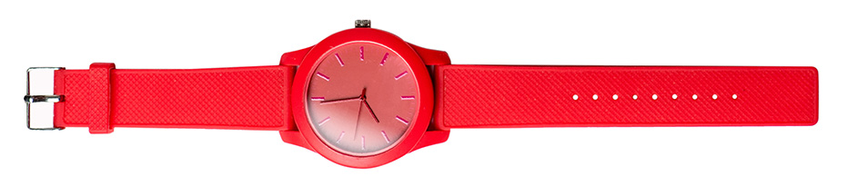
Red: Boldness and energy: Red can signify passion, strength, and attention-grabbing style. Red accents on watch dials or straps can add a dynamic and sporty flair.
Green: Nature and renewal: Green is associated with nature, and freshness. Green watches can convey a sense of vitality and are often chosen for a unique and distinctive appearance.
Yellow and Orange: Vibrancy and energy: Yellow and orange are lively colours that add vibrancy to a watch design. They are often used for sporty and casual watches, expressing a sense of energy and fun.
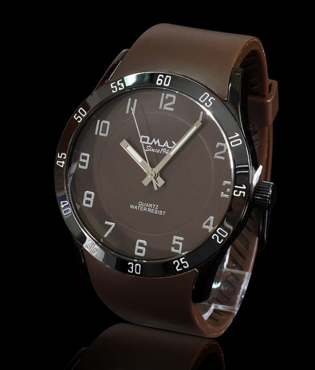
Brown: Warmth and earthiness: Brown is a colour that can evoke a sense of reliability and comfort. Brown leather straps, in particular, are popular for their classic and timeless appeal.
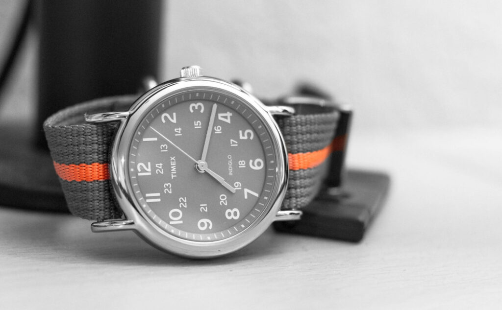
Grey: Neutrality, sophistication and modernity: Grey dials or cases are often chosen for their versatility and ability to complement various styles. This is the Timex Weekender:
Platinum: Elegance and timelessness: platinum-coloured metals (few watches are made of actual platinum these days, other than some of our own), such as stainless steel, are widely used in watch cases and bracelets for their versatility and enduring appeal.
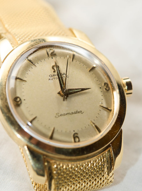
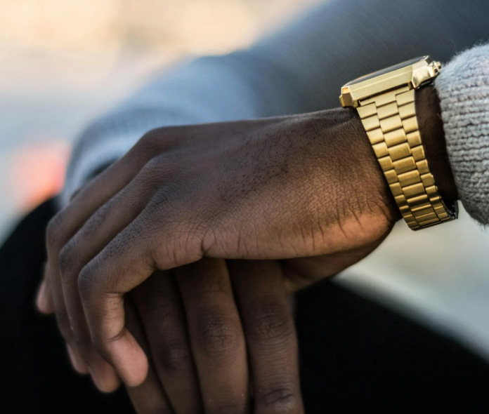
Gold: Luxury, wealth, and opulence: Gold accents or cases are commonly used in high-end and prestigious watches, emphasizing a sense of exclusivity. Gold has been used in watches since the beginning, but has waxed and waned in popularity in more recent times (see below). An example is this Omega Seamaster:
The Rise of Gold in Watches:
In the mid-20th century, gold became synonymous with luxury and prestige, leading to a surge in its popularity in watch design. Gold watches were considered status symbols, and many high-end brands embraced this trend, crafting timepieces with gold cases, bracelets, and accents. The warm and opulent tones of gold appealed to those seeking a symbol of affluence.
The symbolism of a gold watch as a retirement gift, often personalized with engraving including the retiree’s name, the duration of service, and sometimes a personal message or company logo, dates back to the mid-20th century, and its origins are often associated with industrialization and the rise of corporate culture.
Peak Popularity:
During the 1980s and 1990s, gold watches reached their zenith in popularity. Iconic timepieces from renowned brands featured prominently in the market, and gold watches were often associated with success and prosperity. The trend extended beyond traditional yellow gold to include variations like rose gold and white gold, offering consumers a broader spectrum of luxurious options.
Shift in Preferences:
As the 21st century unfolded, there was a notable shift in consumer preferences. Many individuals began favouring understated elegance and versatility over conspicuous displays of wealth. Stainless steel and titanium gained prominence as alternatives to gold, providing a more contemporary and subdued aesthetic. The rise of minimalist design also contributed to the decline of flashy, gold-dominant timepieces.
Fall of Gold’s Dominance:
The economic downturn of the late 2000s further impacted the popularity of gold watches. Consumers became more cautious about conspicuous consumption, and the perception of gold as ostentatious led to a decline in demand. The watch industry responded by diversifying materials and designs, moving away from the dominance of gold in favour of more versatile and accessible options. Although, having said that, from my personal observation, very ostentatious gold watches seem to be popular currently in the wealthy parts of the middle east.
Resurgence in a Modern Context:
In recent years, there has been a subtle resurgence of gold in watches, albeit in a more refined and modern context. Rose gold, in particular, has experienced a revival and is appreciated for its warm, contemporary appeal. Brands are now incorporating gold accents strategically, blending them with other materials like stainless steel or ceramic to create a balanced and sophisticated look that caters to evolving consumer tastes.
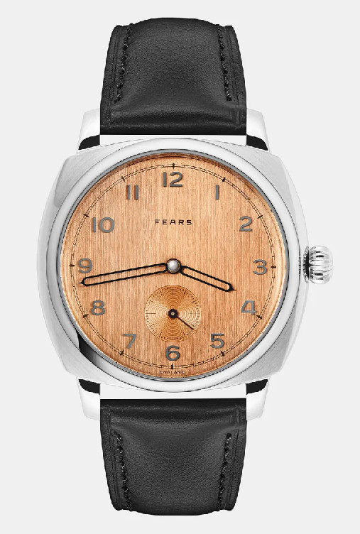
And finally, the salmon-coloured dial, which can be traced back to the early to mid-20th century. Inspired by traditional enamelling techniques, watchmakers began experimenting with dial colours beyond the conventional white, black, and platinum. The warm and subtle tones of salmon were achieved through a combination of materials and firing processes. In recent years, there has been a resurgence of interest in salmon-coloured dials. Watch enthusiasts and collectors have shown a renewed appreciation for vintage-inspired designs, and watchmakers have responded by reintroducing this distinctive colour. Contemporary watch brands have embraced salmon dials in limited editions and special releases, combining traditional aesthetics with modern technology. This is the Fears Brunswick 38 Copper Salmon:
Artistic Movements that Affected Watch Aesthetics
Over time, various style movements, such as Art Nouveau, Art Deco, and later modernist movements, influenced watch design. Each movement brought its own aesthetic principles, impacting the shapes, colours, and decorative elements of watches. The evolution of watch design has been intricately linked to the broader artistic trends and movements of the time.
Emerging in the late 19th century, Art Nouveau sought inspiration from natural forms and organic shapes. This movement influenced watch designs with flowing lines, intricate patterns, curved numerals rather than straight ones, and delicate details. Watches from this period often featured elaborate engravings and sweeping curves, reflecting the overall ornamental and romantic characteristics of Art Nouveau.
The Molnár Fábry Architectural Art Piece:
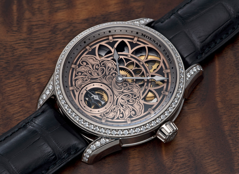
. . . this unique and beautiful watch has an elaborate engraved dial inspired by Art Nouveau.
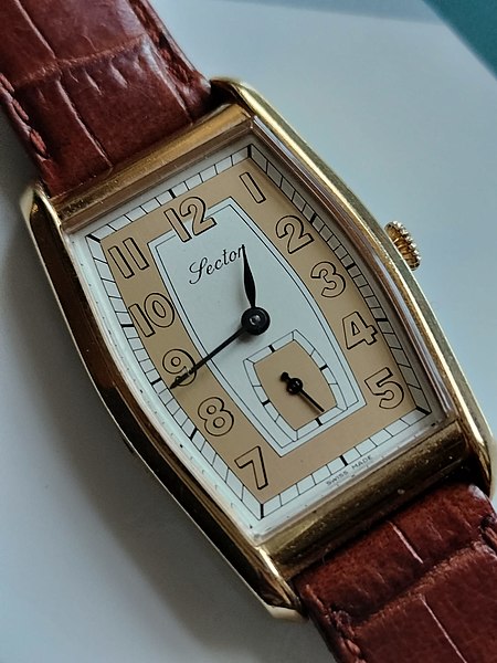
The Art Deco movement, prevalent in the 1920s and 1930s, brought about a shift towards geometric shapes, bold lines, and a sense of modernity. Watch designs during this period showcased strong symmetry, high contrast, and the use of materials like onyx, diamonds, and platinum. The emphasis on sleek and streamlined aesthetics mirrored the elegance and sophistication of the Art Deco era, such as this Sector watch:
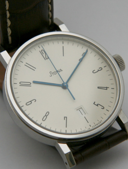
The Bauhaus movement, which emerged in the early 20th century, emphasized functionality, minimalism, and simplicity. This had a profound impact on watch design, leading to clean, uncluttered dials, and a focus on legibility. Bauhaus principles influenced the creation of iconic timepieces with a timeless and utilitarian appeal, such as this Stowa watch (a contemporary Bauhaus‑inspired design, drawing on 1930s minimalism):
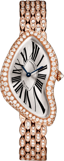
Surrealism, an avant-garde movement of the 20th century, inspired watch designs that embraced dreamlike and fantastical elements. Some watches incorporated imaginative motifs, asymmetrical shapes, and unconventional materials, reflecting the surrealists’ desire to break away from traditional norms and explore the subconscious. A great example is the Cartier Crash (no longer shown on the Cartier website). Although not officially linked to Surrealism, the Cartier Crash has been interpreted in that context due to its fluid, dreamlike form:
In the mid-20th century, Pop Art influenced watch designs with vibrant colours, bold graphics, and playful imagery. Watches during this period often featured whimsical and unconventional designs, incorporating popular culture references. The focus on mass appeal and consumer culture translated into watches that were both artistic and accessible. An example is the Swatch Roy Lichtenstein watch.
The Postmodernist movement challenged traditional design norms and embraced eclecticism. Watch designs influenced by Postmodernism often featured a mix of styles, materials, and cultural references. This period saw experimentation with unconventional shapes and the incorporation of diverse design elements.
In recent times, contemporary art movements continue to inspire watch designers. Collaborations between artists and watchmakers have resulted in limited-edition timepieces that showcase unique artistic expressions.
While art movements are significant, it can be argued that there is an even more significant revolution in the Western Art Tradition, which I named the Direct Complexity revolution, with its climax observable in abstract art, ambient music and art jewellery, which has interesting implications for watch creation which I will detail below.
Watch Aesthetics Now: Story and Concept, Tradition and Innovation
Watches have design influences associated with various things, which serve both as design inspiration, and maybe more importantly, a significant story.
For example, the Audemars Piguet Royal Oak was designed in a single night, inspired by the design of an old fashioned diver’s helmet affixed to the diver’s suit by 8 screws.
The Patek Philippe Nautilus was inspired by the shape of a yacht porthole:
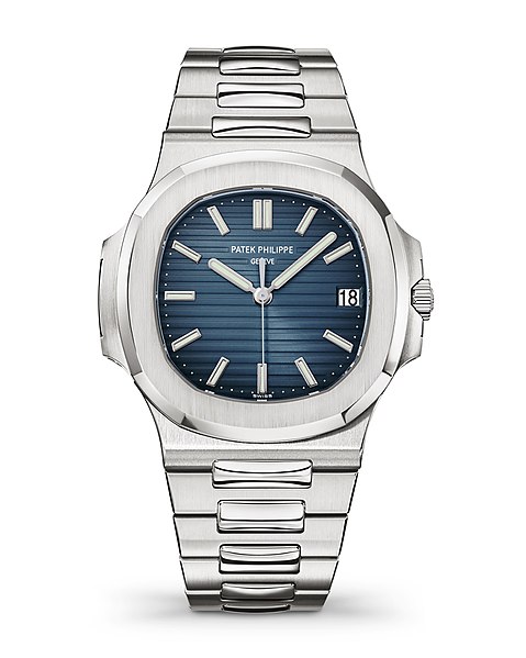
. . . and Hublot (another famous watch brand) is the French word for ‘porthole’
The Bremont Supersonic Watch Collection produced 3 watches, in stainless steel, rose gold and white gold. Each watch incorporated a ring of aluminium from Concorde engine components, and a manual-wind calibre with the silhouette of the famous aircraft.
MB&F released Horological Machine 7 (The Aquapod), which is inspired by the form of a jellyfish:
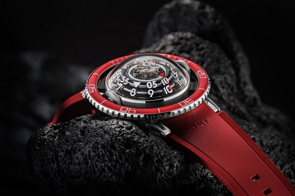
Many watches these days use engineering for its aesthetic appeal, in addition to it being displayed as an impressive accomplishment and often forming part of a story. This includes proudly displaying the intricate workings of the movement, unlike most watches a generation ago where the movement was hidden from view. A great example is the HYT Conical Tourbillon (below), which has a unique fluidic indication as well as the tourbillon complication:
A lot of watches look very similar currently, known as “homage” watches or more bluntly, watches which copy a lot of the features from designs of famous watches. For example, many watches look like the Rolex Submariner because it is popular. On the other hand, Tudor, similar to Rolex in many ways (and for genuine reasons) was able to achieve its more modest price point by using generic movements and Rolex-manufactured case components. It was begun by the same founder as Rolex (and they are still owned as sister-companies) but marketed to a different demographic.
Present-day wearable technology, particularly within the smartwatch sector, is said to frequently fall short of expectations in terms of aesthetics. Instead of embracing the current technology, these designs seem to be attempting to conceal it.
In some ways, current watch design spans a broad spectrum of traditional and innovative influences, although from a different perspective, almost all watches still have engineering and/or fine jewellery as their main design influences (with an interesting exception I’ll detail below).
Other ways to generate an interesting story for a watch include collaborations with artists or other industries, and celebrations of celebrities or events. An example is the Hublot Big Bang Ferrari:
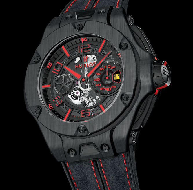
The collaboration between luxury Swiss watchmaker Hublot and Italian sports car manufacturer Ferrari has produced several iconic timepieces. It features design elements inspired by Ferrari cars, such as the use of materials like carbon fibre and innovative case shapes resembling car components.
Watch Aesthetics Breaking Free from Former Limitations
Arising partially out of are movements like the Bauhaus and the Arts and Crafts movement, art jewellery can be seen as more of a broadening of possibilities than a specific art movement. From the beginning it has transcended the narrow accepted possibilities inherent in most fine jewellery, being open to a much wider range of materials, forms, and textures. Art jewellery also relates to authenticity and things being what they are, instead of being decorated, disguised, or polished to relate to symbolic concepts (as is done in fine jewellery).
This broadening of acceptable possibilities has had a significant effect on the more creative and innovative end of watchmaking, such as watches featuring wood or ordinary stone (rather than gemstones), or unpolished surfaces, whether the relationship between the new timepiece design options and the concepts of art jewellery, is understood or not.
Art jewellery can also be seen as part of the Direct Complexity revolution (arguably the most significant of all revolutions in the Western Art Tradition), which can be seen as being caused by the same underlying evolution which resulted in abstract art and ambient music.
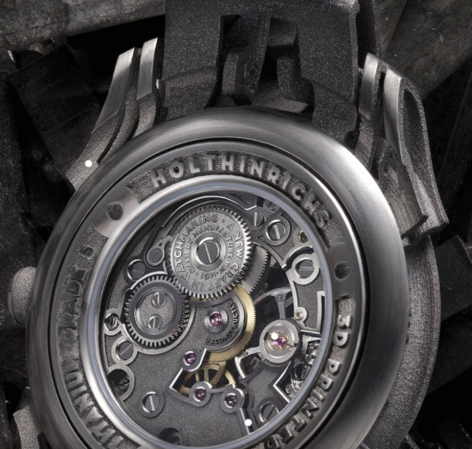
Examples include the proudly displayed 3D printed surfaces on Holthinriches watches:
. . . or the unpolished machined dial of Ochs Und Junior watches:
The complex unpolished surfaces of the above two watches place them outside of what is generally accepted in the fine jewellery space, making them, in my view, part of the art jewellery space which often features complexity in both its forms and its surfaces (not requiring everything to be highly polished as fine jewellery does).
More examples, as well as a clear definition of art jewellery, can be seen on my infographic illustrating the influences of art and art jewellery on watchmaking.
Which leads us to a case study of the aesthetic influences on my own brand . . .
UnconstrainedTime Aesthetic Inspirations
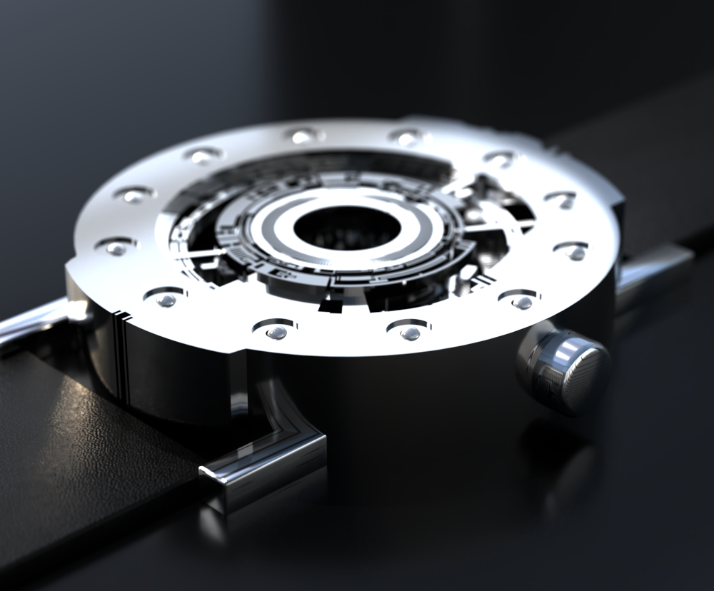
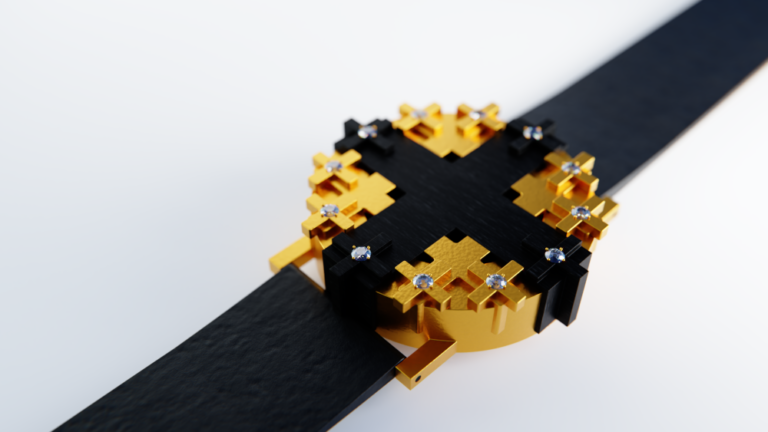
My aesthetic influences for UnconstrainedTime watches are unusual, because not only did I have no experience as a watchmaker, I also found that many conventional watches were not of interest to my personal aesthetic tastes. I created several of our watches before I’d even heard of the word microbrand.
My influences were from my background in fine art and cutting-edge contemporary music, working in synergy with our time-display based on the fundamental 12-point time ring concept originating in the ancient Near East. It was only after I’d created some art-based watches that I was pleased to discover that my timepieces aligned well with the creative freedoms of art jewellery and the desire for innovation, uniqueness and creativity of some microbrand enthusiasts.
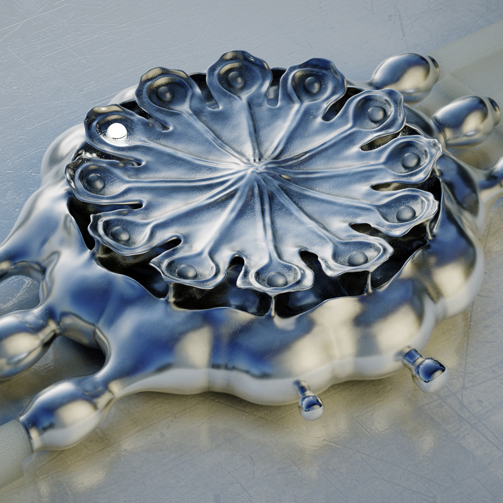
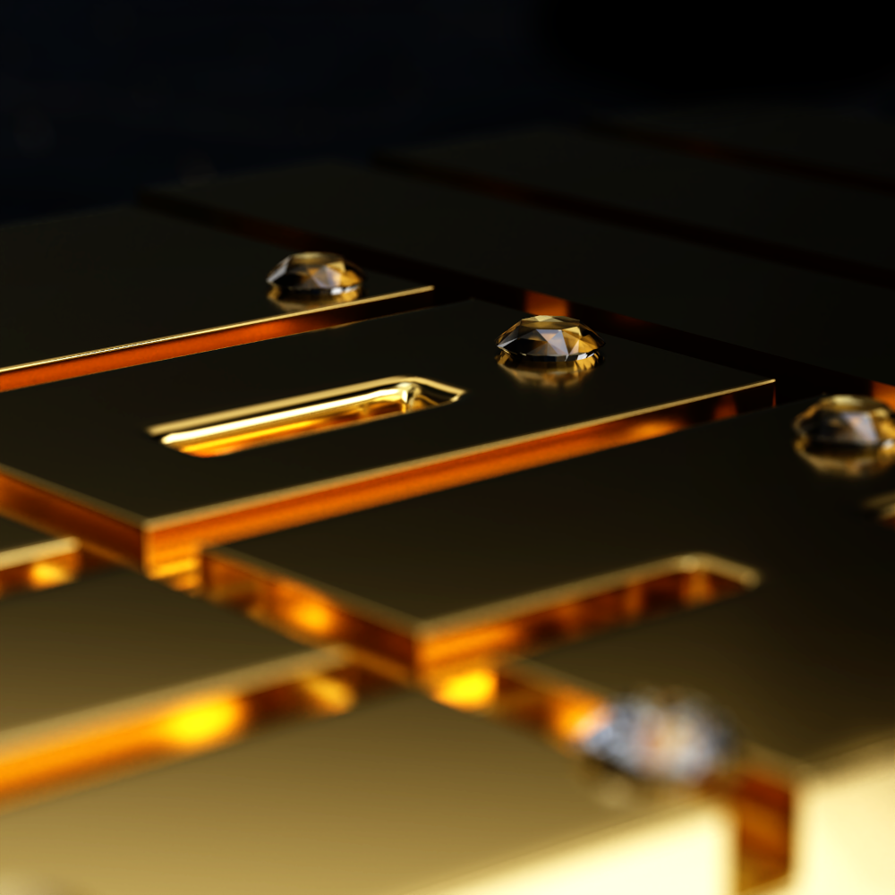
The specific influences of our initial watches come from my life-long artistic obsessions which include fractals, organic forms and textures and the aesthetic essence of musical genres. I collect ideas whenever I come across them, both images and written concepts, then experiment with the best of them.
For our brand launch I wanted to show some examples from the wide range of different aesthetics that can fit with our brand, and loved exploring a few of the creative possibilities facilitated by our simple, small foot-print time-display. I have a section of an article detailing the specific inspirations for my watch creations.
UnconstrainedTime watches are different from most watches, being fundamentally based on freely chosen aesthetics (which is one of the defining factors of art) rather than the engineering or fine jewellery influences which are the main aesthetic basis of almost all watches. Our watches are not like collaborations between watchmakers and artists where the watch and the art usually have very little influence over each other . . . our watches are the art, and the art is the whole watch, not just a dial inside an otherwise standard timepiece.
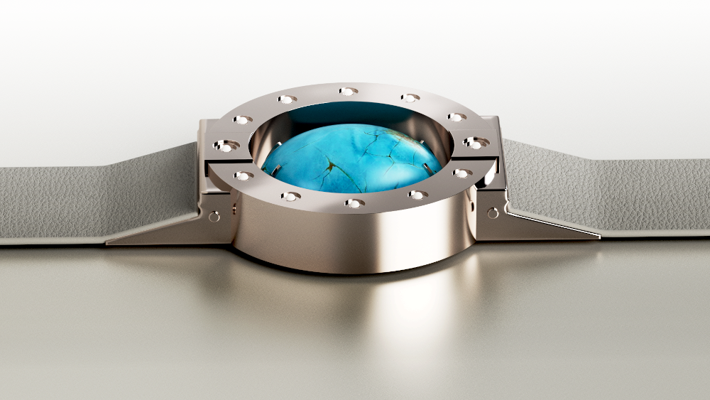
Each UnconstrainedTime piece is conceived and executed as a unified artistic vision, then personalized by your choice of materials:

See details on the aesthetic inspirations for each of our watches.
If you’re interested in any of our UnconstrainedTime watches . . .
Don’t miss our launch! . . .
Get notifications here for early access to our small numbered releases, exclusive creator insights, and behind-the-scenes glimpses of our artistic process before they’re shared anywhere else.
Which watch aesthetics do you find most interesting, and for what reason? Tell us in the comments below . . .
Author: Chris Melchior

This article was authored by Chris Melchior, founder of UnconstrainedTime and creator of the original range of wrist-worn sculptures of this unique artistic adventure.
Chris has extensive knowledge and experience of creativity, including fine art and cutting-edge contemporary music composition, and was awarded a First Class Honours Degree in fine art and music, with a minor in philosophy, from a leading UK University.
Chris’s life-long artistic obsessions include organic forms and textures, abstraction, fractals, and the aesthetic essence of musical genres.
He has developed unusually deep insights into the elemental concepts underlying areas including Eastern and Western philosophies, science and technology, creativity and the arts, as well as advanced empirical spirituality in which he is acknowledged as a leading authority.
He has a profound fascination and love for the unique and synergistically creative combination of fine art with the ancient essence of time-keeping which evolved into the UnconstrainedTime project.
Leave a Reply