Sections of this article:
- Secrets of effective watch logo design.
- The history of watch brand logos
- Elements of great watch logo designs
- The evolution and meaning of famous watch brand logos. How they symbolize the most vital elements of the brand
- The meaning of microbrand watch logos
- Design secrets of the UnconstrainedTime logo.
Introduction.
This article about watch logos unveils their horological significance and explores how and why they work the way they do, for the big brands, for microbrands, and for our own brand.
I start by looking at the essentials of how effective watch logos are designed, including tips for designing them yourself, followed by the history of watch brand logos, laying the foundations that relate to our next section on the elements of great watch logo design.
I then delve into examples of watch logos from some of the big brands and how they function to convey the essence of each brand.
That is followed by a detailed look at how microbrands use their logos to convey their own meaning, and how that fits with the creative freedoms and innovations that being a microbrand facilitates.
Finally I let you in on the secrets of my own logo design for this UnconstrainedTime watch brand with a detailed case-study of how it evolved through more than one version.
This article includes a beginner-friendly tutorial on logo design as well as content which is more towards an expert analysis, with perspectives suitable for beginners, experienced designers, watch enthusiasts, and brand strategists. Hopefully there is something of interest to everyone.
Secrets of effective watch logo design.
Designing an effective company logo necessitates combining creativity and strategic thinking with a deep understanding of the brand’s identity. A logo represents the company’s values, mission, and uniqueness.
It’s more than just a symbol; it’s the visual embodiment of a brand’s essence. A successful logo resonates instantly, making effective use of elements like colour, typography, and symbolism to narrate a brand’s story, as detailed in this article: “How to design a logo that tells a story“
Simplicity with uniqueness, scalability, and timeless appeal are the hallmarks of an enduring logo.
We’ll be looking at how great watch logos work, later in this article, but to start with here are the essential secrets for designing an impactful watch logo. For each of the points in this section, see for yourself how they apply to the logos of the watch brands below:
Understand the Brand:
Before even thinking about the design process as such, you need to understand the brand’s identity, values, target audience, and industry positioning. Having a good grasp of these elements lays the foundation for the logo’s direction. Analyse the brand’s personality, its vision, and what sets it apart from competitors. This article gives a handy check-list of questions to do this: “50 questions to ask clients when designing a logo.”
Then brainstorm how aspects of the brand essence suggest visual elements, and use those as starting points for the logo ideas. Also write out what visual elements would not fit that brand essence, to help with choosing which initial ideas are the best fit.
Simplicity and Memorability:
Simplicity is paramount in logo design. A simple yet memorable watch logo is easily recognizable and leaves a lasting impression. Think of iconic logos like Apple, Amazon or Nike, which are straightforward and instantly identifiable.
Avoid complexity unless there is a strong justification for it, as overly intricate designs can be challenging to reproduce and may not resonate so easily with audiences, especially these days.
Versatility and Scalability:
A great logo should look good across various mediums and sizes, from billboards to business cards. It should maintain its integrity and impact whether displayed on a large-scale poster or a small mobile screen.
Ensure the logo can be scaled easily without losing its clarity or significance, including making sure it is in vector format (since bitmap images cannot be up-scaled without degrading quality).
Brainstorm before critiquing?:
It can be tempting to combine coming up with new ideas with deciding which ideas are not so good. Some researchers say that it will usually work more effectively to brainstorm completely openly, making notes or sketches of whatever ideas come into your head, without any censorship at all . . . working that way allows new ideas to flow more easily. On the other hand, there are opinions that carefully worded comments can actually help with creativity in a group situation, as described in the article It’s Actually Helpful to Criticize Ideas When You’re Brainstorming. I recommend you try both and see what works best for you. For me it is optimal to have a clear aim but brainstorm openly first, then edit later.
After you’ve found all the possible ideas you think you can, then go back and look through them, extend your range of options by seeing if any of the initial ideas suggest other directions, or try combining elements from two ideas (although it is unusual for that approach to yield good results). Then order them in terms of which options seem to be working best, as you go through the other points mentioned here.
Color and Typography:
Colour psychology plays a significant role in branding. Choose colours that align with the brand’s personality and evoke the desired emotions, such as in the above example of the Omega logo. Similarly, font selection should reflect the brand’s tone.
Consider how colours and fonts convey the intended message and resonate with the target audience. The Wikipedia article Color psychology is one of the more thorough sources of relevant information.
Timelessness and Adaptability:
A timeless logo remains relevant despite evolving trends. While it’s essential to stay current, avoid following fleeting fads that might date the logo quickly. Aim for a design that can be adapted to future changes without losing its essence.
The Twinings Tea logo (unrelated to watchmaking) is recognised as the world’s oldest unchanged company logo, the same now as it was in 1787. See how it still makes sense with the brand, even today:
Of watch logos, Longines’ winged hourglass logo (below), registered in 1889, is the oldest still active registered trademark (although I show you the logo of an older watch brand, below, and the oldest of all watch logos, in other sections of this article):

Originality and Uniqueness:
Strive for originality to set the brand apart from competitors. Conduct thorough research to ensure the proposed logo design doesn’t resemble existing trademarks or logos (which would prevent it being used legally). A unique logo which is an optimal fit with how the brand itself is different to others, helps the logo stand out, making it more memorable in the minds of consumers.
Test and Iterate:
Seek feedback from a diverse set of perspectives before finalizing the logo. Conduct surveys or focus groups to gauge audience reactions and preferences.
Social media platforms such as FaceBook make it easy to ask people’s preference from several options. It can be ideal to ask on Groups where your target audience hangs out.
While doing this, keep clear evaluation criteria in mind, for example, asking people which logo they like best (without context) is the wrong question, since what matters most is how well a logo fits the brand essence rather than personal preferences. And, of course, you also need to ask the right people, i.e. the brand’s target audience.
Iterate your designs based on the feedback received, refining the options to enhance its effectiveness and resonance.
Professional Execution:
While there are do-it-yourself options available (see below), hiring a professional designer often yields superior results. Professional designers possess expertise in creating impactful visuals, ensuring the logo aligns perfectly with the brand’s identity and goals. Outsource sites like Fiverr or UpWork offer many logo designers at various price points, so pick one which is a good fit for your requirements and budget.
Beginner-friendly tips for designing a logo yourself: If you are designing a logo yourself, for most logos one of the most important things is to make sure the final design is a vector image (made of lines), which can be scaled to any size without losing quality, (unlike bitmapped images, which are made of pixels).
Inkscape is a free vector image software suitable for logo design, with the core features of Affinity becoming free in 2025, (although there are paid features, and a free Canva account is required for the free version) which is an alternative which is said to be slightly easier to learn. For other options, search for “vector editing software”. As well as the necessity of having the final logo as a vector for scalability, vector software is a much better fit for the creation and transformation processes needed for most logo design, than bitmap software is, making the process quicker, easier and more effective.
Generally, how well the logo conveys the essence of the brand and how it differs from others is more important than whether you like that logo best or not. A common mistake with inexperienced designers (or clients) is for them to want something they just “like” (even if it is not a match for the brand at all) rather than something which actually fits the brand best. To decrease the likelihood of that happening, clearly define the process which includes determining the brand essence and how it is unique, and the criteria for evaluating the results such as how well the logo fits the brand, before you start work, and adhere to it.
Another common error when doing design work with inexperienced designers or clients is for them to look at some of the initial ideas and say they like different aspects from several different ideas and want to combine them. This is unlikely to produce good results, because a combination of elements from different concepts won’t be as strongly unified as a single concept where all the parts are working optimally together.
There are many AI platforms that can design logos. Lovart is one of the more “intelligent” options at the time of writing, functioning as more of a thorough design agent rather than just a basic image generator. Since AI platform choices are changing rapidly, it makes more sense for you to research options yourself than for me to list current ones here. Find an option which will take into consideration the brand essence as effectively as possible, and experiment with prompts to enhance this factor (see below).
Only start using AI to suggest options after you have clearly defined all the design criteria as detailed in this article, and keep the focus on what most effectively embodies the brand essence, rather than what you might personally like. Keep in mind that some AI platforms can do in-depth research and help you create better prompts to get better results with other AI platforms, as well as the option of refining results within a single platform. Try a variety of different AI platforms so you can choose from the widest range of options, and refine the results from there. Also keep in mind the legal implications concerning AI‑generated images and trademark originality etc.
And lastly . . . remember my #’1 rule of any design or art work . . . if you can’t explain clearly why each specific element is the very best fit for the overall concept, then there is room for improvement.
An effective company logo serves as a visual ambassador, communicating a brand’s identity and values to the world. It requires a strategic approach, creativity, and an understanding of the brand’s essence. By considering simplicity, versatility, originality and other key factors, as outlined above, a well-designed logo becomes an enduring symbol, loved by the fans and giving newcomers an instant feel for what the brand is about.
You’ll read about some great examples of watch design, below, with details of how they achieve their effectiveness.
The history of watch brand logos
The history of watch brand logos is a captivating journey intertwined with the evolution of timekeeping itself. Starting from simple marks denoting craftsmanship to sophisticated emblems symbolizing prestige and innovation, watch logos have developed to play a pivotal role in defining a brand’s identity.
Initially, logos were ornate familial symbols denoting craftsmanship and lineage. Over time, they evolved into simple, powerful designs, reflecting modernity and sophistication in sync with the changing horological landscape.
Early Origins:
Centuries ago, watchmakers used signatures or maker’s marks to identify their creations. These marks were often initials or symbols beautifully etched onto watch components, showcasing the artisan’s craftsmanship. As watchmaking advanced, these marks evolved into rudimentary logos, representing individual watchmakers or workshops.
Incorporating Symbols and Crests:
During the 18th and 19th centuries, watch logos began incorporating family crests, symbols, or heraldic imagery, reflecting the watchmaker’s heritage and status.
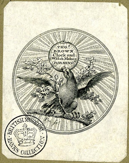
The above image is a watch paper (used as advertising, inserted into the inside of a pocket watch cover) from a watch by Thos. Brown, Clock & Watch Maker, Birmingham (1796)
Ornate logos adorned prestigious timepieces, serving as symbols of craftsmanship and nobility. Examples include the intricate crests on early pocket watches from renowned watchmakers like Breguet and Vacheron Constantin.
Transition to Modernity:
The dawn of the 20th century marked a shift towards more stylized and minimalist logo designs. Watch brands embraced simplicity, adopting distinctive typography and iconic symbols to represent their identity. Notable examples include the timeless elegance of the Longines winged hourglass, symbolizing precision and sophistication, and the enduring simplicity of the Omega name within a stylized Greek letter, denoting perfection and achievement (more details on specific watch brand logos, below).
Iconic Logos:
Certain watch logos have achieved iconic status, becoming synonymous with excellence and luxury.
The Rolex crown logo, introduced in the 1920s, epitomizes prestige, precision, and superiority in watchmaking. Audemars Piguet’s interlocking initials “AP” and Cartier’s intertwined “C” are emblematic of heritage, craftsmanship, and sophistication, standing as enduring symbols of their respective brands.
Innovative Evolution:
As the watch industry expanded, logos evolved to embrace modern aesthetics and technological advancements. Brands like TAG Heuer and Breitling (below) incorporated sleek typography and dynamic design elements into their logos, symbolizing innovation, performance, and a forward-thinking approach.
Contemporary Trends:
In recent decades, watch brand logos have adapted to contemporary design sensibilities.
Brands such as Hublot and Richard Mille experiment with bold, unconventional logos, reflecting their avant-garde approach and cutting-edge technology. These logos often transcend traditional norms, symbolizing innovation and pushing the boundaries of horology. There are examples of extraordinary watches from both of those brands, in my article on unusual watches.
Microbrands and Artisanal Logos:
In the current era, the rise of microbrands has introduced a new wave of logos that emphasize craftsmanship and individuality.
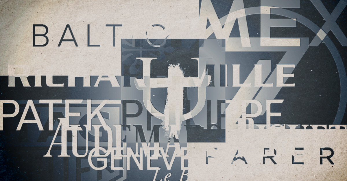
Brands like Baltic, with their minimalist logo, or Farer, incorporating unique typography, symbolize artisanal craftsmanship and a niche appeal to watch enthusiasts seeking uniqueness. See those and lots of examples of other microbrand logos below.
The history of watch brand logos is a testament to the evolution of watchmaking, artistry, and watch brand identity. From humble beginnings as simple markings to becoming iconic symbols of heritage, innovation, and craftsmanship, watch logos continue to narrate stories of tradition, sophistication, and technological advancement in the timeless world of horology.
Elements of great watch logo designs.
A watch logo serves as a vital element in distinguishing a brand, encapsulating its identity, values, and heritage. There are little-known intricacies and hidden influences that contribute to the design of an exceptional watch logo.
Watch logo design extends far beyond what initially meets the eye; it encapsulates a brand’s story, values, and craftsmanship. The intricate details, historical influences, and subtle nuances within these logos weave captivating narratives, showcasing the artistry and thoughtfulness behind each emblem within the horological landscape.
Symbolism and Historical Context:
Watch logos often embed subtle symbols or historical references that echo a brand’s legacy.

For instance, the Longines winged hourglass logo signifies the brand’s historical connection to aviation and precise timekeeping, paying homage to the brand’s involvement in early aviation pursuits, as well as symbolizing freedom, precision, and elegance. For more on this context, read my article on how society affected the development of the wristwatch.
Typography and Elegance:
The choice of typography in watch logos is crucial, reflecting the brand’s style and sophistication. Brands like Audemars Piguet and Patek Philippe employ elegant, timeless fonts to convey their legacy and commitment to craftsmanship. The intricate yet classic typography mirrors the brands’ attention to detail and luxury.
Color Psychology and Brand Identity:
Colours within watch logos carry nuanced meanings that reflect a brand’s personality. For example, Nomos Glashütte’s logo (see below), with its minimalist black and white palette, signifies German precision and minimalism. The understated colours convey sophistication and simplicity, aligning with the brand’s ethos.
Hidden Details and Craftsmanship:
Some logos conceal intricate details that signify craftsmanship and expertise. For instance, Rolex’s crown logo might seem simple at first glance, but upon closer inspection, it reveals the meticulous craftsmanship in its design. The logo’s minute details emphasize precision, aligning with Rolex’s commitment to perfection.
Cultural Influences and Inspiration:
Watch logos often draw inspiration from cultural elements or historical motifs. Seiko’s logo, for instance, intertwines Japanese culture and precision watchmaking. The logo’s design is said by some people to subtly mirror the aesthetics of traditional Japanese calligraphy strokes, infusing cultural essence into the brand’s identity.
Evolution and Adaptation:
The evolution of watch logos reveals how brands adapt while preserving their essence. Omega’s logo transformation from the brand name to the stylized Greek letter “Ω” reflects its journey from traditional to modern aesthetics. This evolution signifies Omega’s adaptability and innovation in the ever-changing watch industry.
Artistry and Symbolic Meanings:
Microbrands often leverage creativity and symbolism in their logos. For instance, Zelos‘ logo (above), inspired by ancient mythology and celestial bodies, symbolizes strength, innovation, and the brand’s passion for unique watchmaking. The logo’s artistic elements reflect the brand’s distinctive approach and storytelling through design.
Minimalism and Impact:
Some logos, like that of Farer, demonstrate the power of minimalism in making a lasting impact. For example Farer’s logo (below) utilizes clean typography to project modernity and adventurous spirit, emphasizing simplicity and sophistication without compromising brand identity.
The evolution and meaning of famous watch brand logos. How they symbolize the most vital elements of the brand.
A watch logo serves as the face of a brand, encapsulating its essence and values. It’s a visual cue that communicates a brand’s identity and its position within the competitive landscape of the watch industry.
Whether it’s precision, innovation, heritage, accessibility, or exclusivity, the brand values expressed are intricately woven into the design elements of watch logos, resonating with consumers and guiding their perception of the brand’s identity and purpose.
See for yourself how each logo relates to the watch . . .
Blancpain:
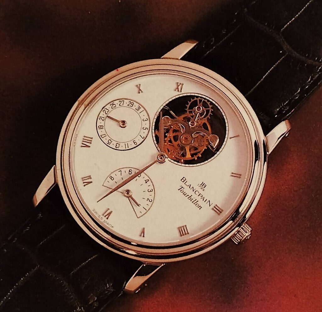
The earliest watch brand still in existence (although it ceased operations in the late 19th century and was revived in the 1980s), with the logo proudly displaying the brand’s origins in 1735.
Some sources say that their logo features an intricately designed stylized “JB” monogram, but a closer look reveals that the letters are more likely to be a stylized “IB”, the initials of Blancpain‘s founder Imer Blancpain, born in the small village of Villeret in 1639.
Vacheron Constantin:
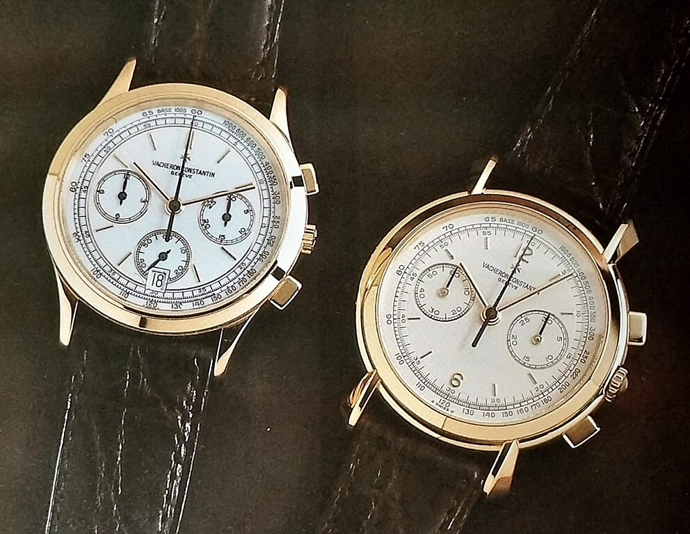
Founded in 1755, this brand has the oldest of all watch logos and the oldest continually operating watch brand. Vacheron Constantin‘s logo conveys their esteemed position as one of the oldest watch manufacturers in continuous operation.
The Maltese cross in the logo symbolizes the brand’s commitment to craftsmanship, heritage, and tradition. It represents the values of excellence and meticulous attention to detail in watchmaking, echoing the brand’s mission to produce exceptional and enduring timepieces.
Rolex:
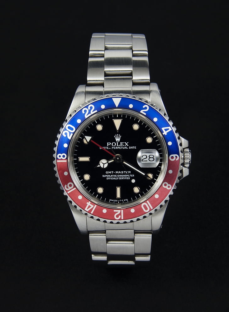
The iconic crown logo of Rolex is an embodiment of luxury, prestige, and exclusivity. The crown symbolizes superiority, asserting Rolex as the “king” of watches. This logo communicates the brand’s (relatively) high-end positioning, targeting affluent consumers who seek unparalleled craftsmanship and status symbolization.
The Rolex crown logo has undergone subtle changes since its inception in the 1920s. Initially, it featured a textual inscription alongside the crown, which gradually evolved into the minimalist, timeless crown emblem seen today. Its evolution signifies Rolex’s enduring commitment to precision and luxury.
TAG Heuer:
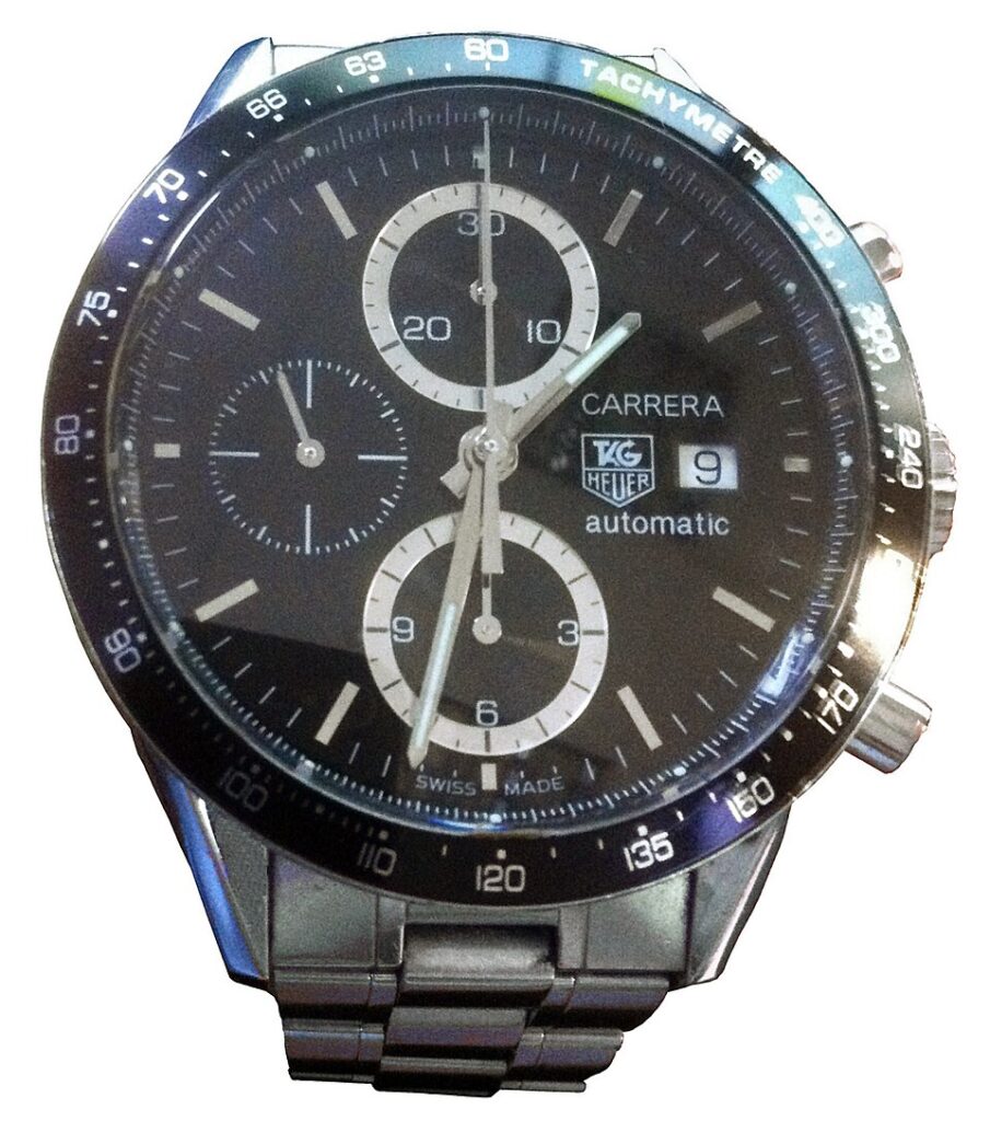
TAG Heuer‘s logo, characterized by bold typography and a shield emblem, signifies innovation, precision, and a sporty lifestyle. The logo’s dynamic design aligns with the brand’s positioning as a luxury sports watchmaker, targeting a niche audience seeking high-performance timepieces. This is an example of how a watch brand logo will relate to the current focus on story and concept in watchmaking.
Initially their logo featured the brand’s only the word “Heuer”, later adding the abbreviation TAG, which stands for Techniques d’Avant Garde, a holding company that acquired Heuer in 1985. The merger formed TAG Heuer. The redesign signifies TAG Heuer’s shift towards a more contemporary and sporty image, aligning with its commitment to innovation and high-performance timepieces. They can be considered an example of revolutionary watch design.
Timex:
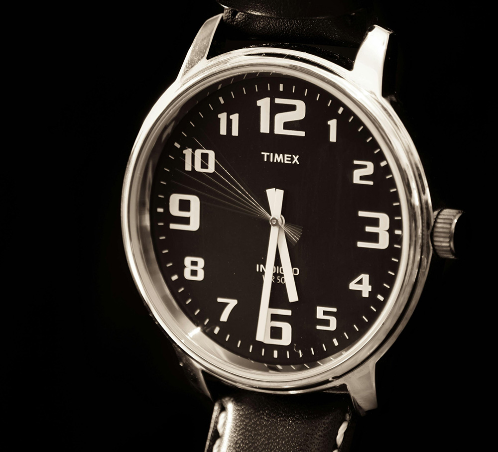
Timex‘s logo, with its casual, bold font, conveys durability, value, and accessibility. The straightforwardness of the logo reflects Timex’s market positioning as a brand offering reliable and affordable watches suitable for everyday wear.
Audemars Piguet:
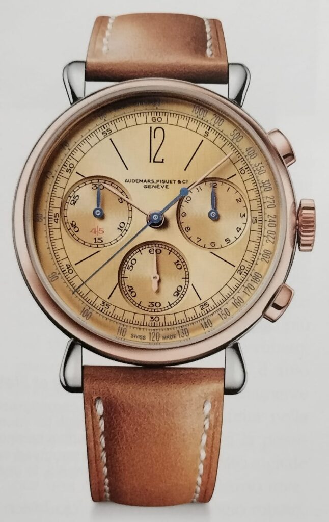
Audemars Piguet‘s interlocking “AP” logo, a nod to the brand’s founders, Jules Audemars and Edward Piguet, exudes elegance, heritage, and craftsmanship. The sophisticated design of the logo reflects the brand’s position in the luxury segment, catering to discerning consumers who value tradition, artistry, and exclusivity. The logo symbolizes the historical partnership and collaboration between the two visionaries, embodying the brand’s rich heritage and tradition of craftsmanship. Their logo has undergone only minor modifications since its inception. For some fascinating insight into how their watches were designed, read my article on watch design inspiration.
Swatch:
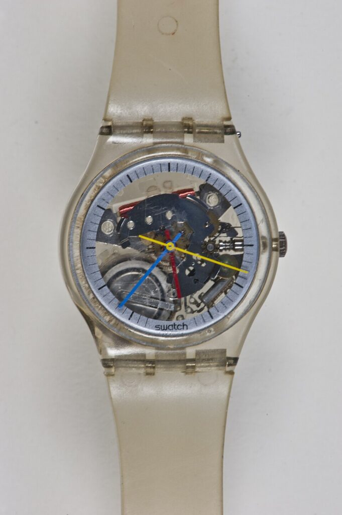
Swatch‘s logo, a playful and colourful design, reflects innovation, creativity, and affordability. The logo’s playful and vibrant nature aligns with Swatch’s market positioning as a brand that offers fun, trendy, and affordable timepieces appealing to a diverse consumer base. The brand’s mission to make watches a fashion statement and accessible to a broad audience is reflected in the logo’s vibrant and dynamic design. Their series of collaborations with artists are mentioned in my article on creative watch design.
Seiko:

Seiko‘s logo, characterized by sleek typography, embodies precision, innovation, and quality. The logo reflects Seiko’s position as a brand known for technological advancements and craftsmanship across various price points, catering to both entry-level and high-end segments. It signifies Seiko’s evolution from its founding in 1881 to becoming a pioneer in the industry, showcasing its historical journey.
Seiko’s logo has evolved from a simple text-based representation to a sleek and modern design. Initially featuring just the brand’s name, the logo transitioned to a streamlined typography with a symbolic crest. The evolution signifies Seiko’s journey from traditional watchmaking to embracing technological advancements and innovation.
Richard Mille:

Richard Mille‘s distinctive logo represents avant-garde design, cutting-edge technology, and exclusivity. The unconventional and bold nature of the logo mirrors the brand’s market positioning targeting ultra-high-net-worth individuals seeking innovative and exclusive luxury watches. One of their watches is used as an example in my article on creative watch design.
Omega:
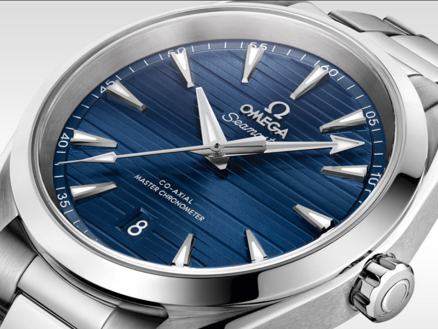
Omega‘s logo, featuring a stylized Greek letter, symbolizes perfection and achievement. Omega’s mission to provide precise and reliable timepieces resonates through the symbolism embedded in its logo.
It represents Omega’s longstanding commitment to excellence and achievement in precision timekeeping since its inception, reflecting the brand’s historical legacy of innovation. The evolution of their logo reflects the brand’s shift towards modernity and innovation. One of their watches is used as an example of watch aesthetics influenced by the golden ratio.
Patek Philippe:
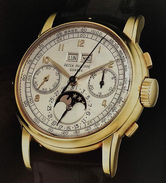
The Calatrava cross in Patek Philippe‘s logo originates from the Order of Calatrava, a 12th‑century Spanish military order. Patek Philippe (founded in 1839 in Geneva, Switzerland) adopted it in1887 as a design symbol. It signifies tradition, excellence, and spirituality. It reflects the brand’s values of heritage, craftsmanship, and timelessness. Patek Philippe’s mission to create enduring, heirloom-quality watches aligns with the symbolism of its logo which has remained largely unchanged throughout its history.
Longines:
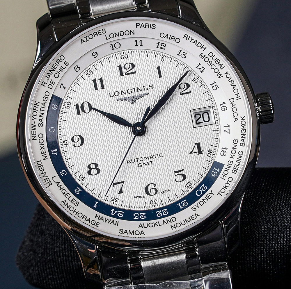
The winged hourglass in Longines‘ logo harks back to the brand’s historical association with aviation and precise timekeeping.
Longines’ logo evolution has seen variations in typography and design elements. From an early version with ornate typography, it transformed into the minimalist emblem seen today symbolizing precision, elegance, and the brand’s historical association with aviation and precise timekeeping.
Cartier:
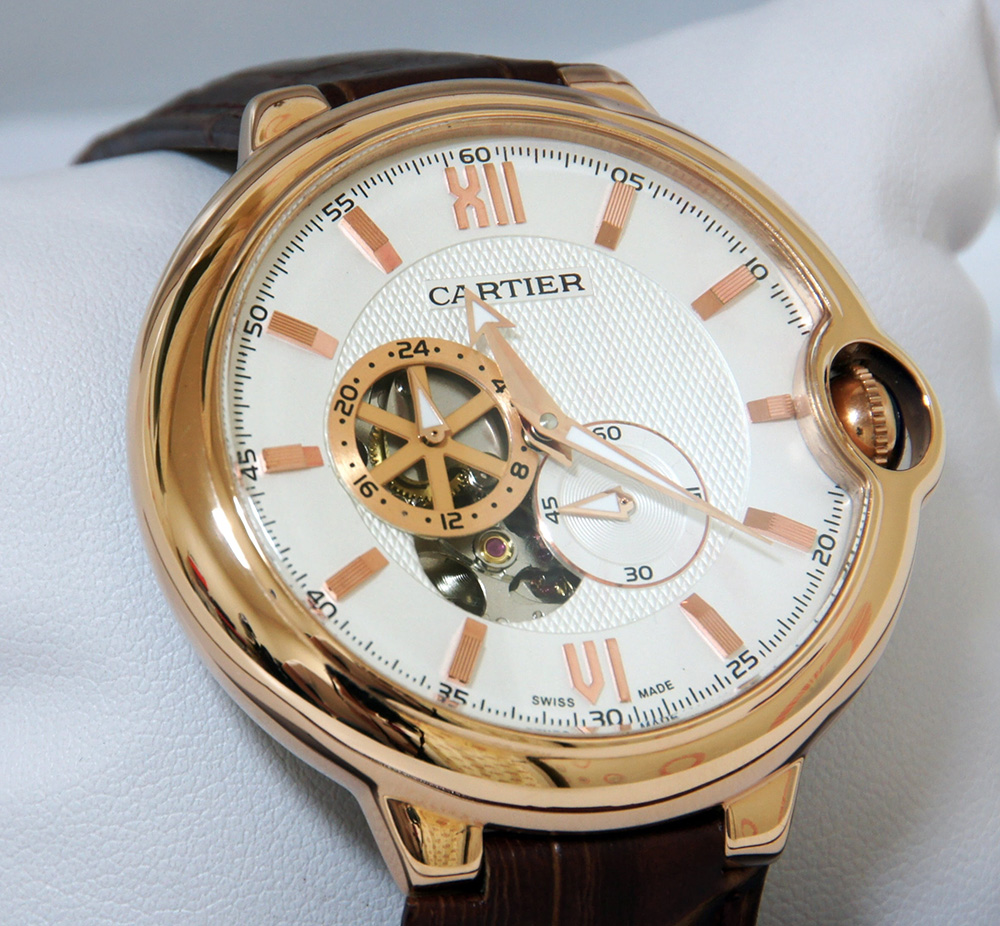
Cartier‘s intertwined “C” logo dates back to the early 20th century and represents the brand’s historical heritage of luxury and elegance. The logo mirrors Cartier’s legacy of crafting exquisite jewellery and timepieces for royalty and aristocracy, symbolizing its historical prestige.
Cartier’s logo has seen subtle refinements while retaining its essence. Initially, the logo showcased the brand’s name in a classic serif font. Over time, it transformed into the intertwined “C” emblem, symbolizing elegance, luxury, and timeless sophistication. The evolution of Cartier’s logo mirrors its journey from a renowned jeweller to an iconic luxury watchmaker. More than one of their watches is included in my article on creative watch design
Breitling:
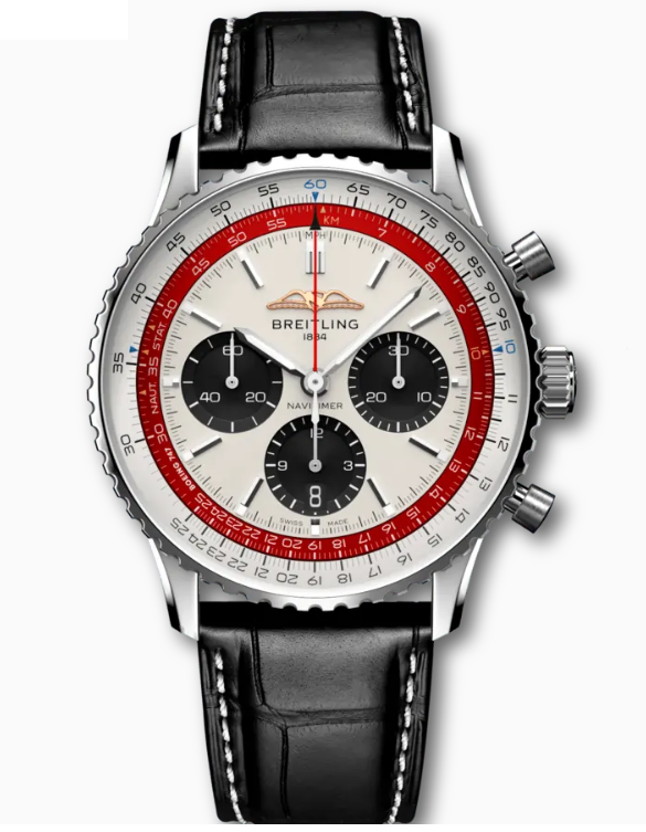
Breitling‘s iconic winged “B” logo can be seen above, with a different logo on the watch. While early Breitling logos varied, the winged “B” introduced in the mid‑20th century aligned the brand with aviation (starting with its association with pilot’s chronographs). Earlier pre‑wing logos existed, but by the 1940s–50s the wings were deliberately chosen to emphasize the aviation theme
Their current logo (above), while upsetting a lot of fans who say they miss the “old” logo, is actually based on an older version of their logo than the winged anchor symbol, and symbolizes a return to their roots.
Tissot:
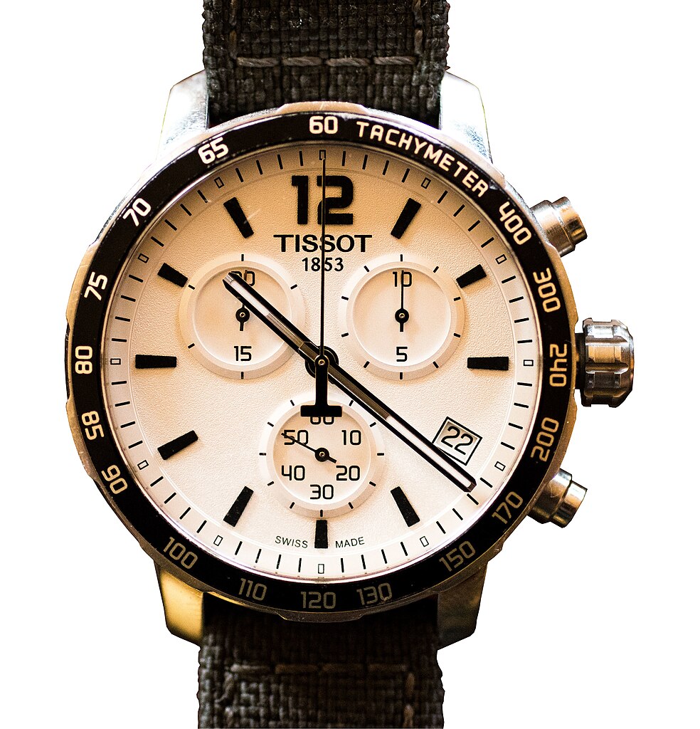
Tissot‘s logo, featuring a plus sign with the letter “T,” represents precision and reliability. However, the incorporation of the plus sign isn’t solely indicative of the brand’s focus on accuracy in timekeeping. Some interpretations suggest that it symbolizes Tissot’s commitment to quality and innovation, transcending mere precision. More obviously, the cross symbol also relates to the flag of Switzerland, the home of the brand.
Rado:
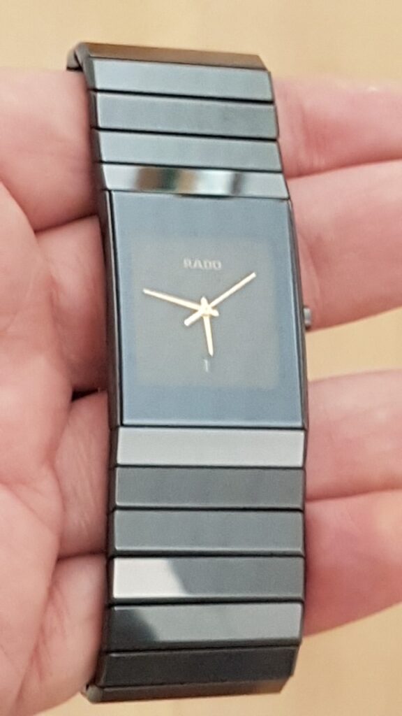
Rado‘s logo, with its bold and modern typography, deviates from the usual symbolism associated with luxury and elegance. The logo, while powerful and contemporary, doesn’t obviously convey the brand’s emphasis on high-end materials like ceramics and technological innovation in watchmaking.
The meaning of microbrand watch logos.
Microbrand watch logos hold a special significance within the horological world, representing the ethos, values, and craftsmanship of independent watchmakers. Their logos convey unique stories and meanings that resonate with niche audiences seeking exclusivity, innovation, and artistry, symbolizing the vision and passion of their creators.
Microbrand watch logos tell captivating stories, representing the passion, creativity, and individuality of independent watchmakers. Each logo encapsulates the brand’s values, inspirations, and dedication to crafting distinctive timepieces that resonate with collectors and enthusiasts seeking uniqueness and craftsmanship beyond the mainstream.
Baltic:
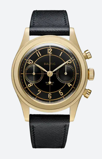
Baltic‘s logo features a classic and minimalist design, reflecting Baltic’s commitment to crafting timepieces inspired by vintage designs.
Farer:

Farer‘s logo, characterized by distinctive typography, showcases the British brand‘s modern and adventurous spirit. The sleek and dynamic font reflects Farer’s focus on contemporary design and exploration. Its unique style symbolizes the brand’s pursuit of distinctive and bold timepieces for the modern traveller.
Halios:
Halios‘ logo portrays a simplified wave motif, symbolizing fluidity, strength, and exploration, echoing Halios’ dedication to crafting high-quality dive watches designed for adventure seekers and water enthusiasts.
Zelos:
Zelos‘ logo incorporates a simple but unique formation of the letter “Z”, symbolizing strength, power, reflecting Zelos’ mission to create unique and innovative timepieces.
Nomos Glashütte:
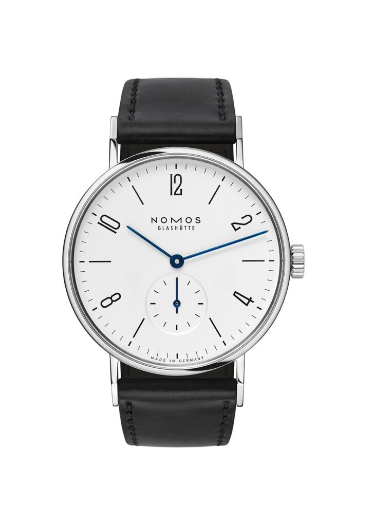
Nomos‘s logo embraces simplicity and sophistication, reflecting the brand’s commitment to minimalism and German precision. The clean typography exudes elegance and precision, mirroring Nomos’ dedication to crafting sleek and meticulously engineered timepieces.
Autodromo:
Autodromo‘s logo draws inspiration from automotive aesthetics and racing heritage. The logo’s vintage-inspired font, the symbol combining the letter “a” and “d”, and the somewhat retro styling echo the design elements found in classic racing cars. It symbolizes Autodromo’s passion for motorsports and the meticulous craftsmanship evident in their retro-themed watches.
Vero Watches:
Vero Watches‘ logo exudes a vintage charm with its retro-inspired typography and styling. The classic font and design elements reflect Vero’s dedication to traditional craftsmanship and timeless aesthetics, showcasing their passion for heritage-inspired watchmaking.
Melbourne Watch Co.:
Melbourne Watch Co.‘s logo combines classic typography with a contemporary twist, and a clever combination of watch hands in the aesthetically preferred positions, with the letter “M”. The elegant font signifies sophistication and refinement while hinting at the brand’s modern approach to watch design. It encapsulates Melbourne Watch Co.’s fusion of timeless style with innovative craftsmanship.
Laco:
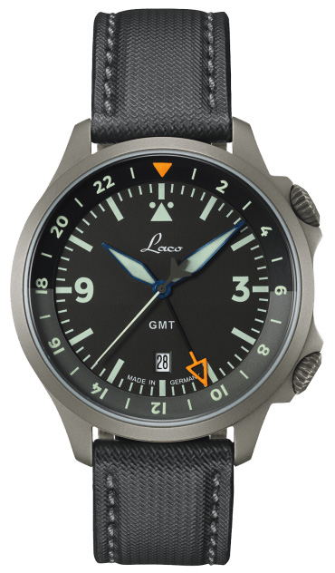
Laco‘s logo incorporates a blend of traditional and modern typography, reflecting the brand’s historical legacy and contemporary outlook. The logo symbolizes Laco’s heritage in pilot watches and precision instrument manufacturing, resonating with enthusiasts seeking authentic aviation-inspired timepieces.
If you want more examples, see my article on individuality in watchmaking.
As a case-study in logo design, I will now go into details of how I created our own logo . . .
Design Secrets of the UnconstrainedTime logo.
From the beginning of designing the UnconstrainedTime logo, I wanted a logo which reflected the combination of an unusual degree of creative freedom, with precision and quality, both inherent characteristics of our brand. I’ll go into detail of my logo design process as a case study showing one way it can be done.
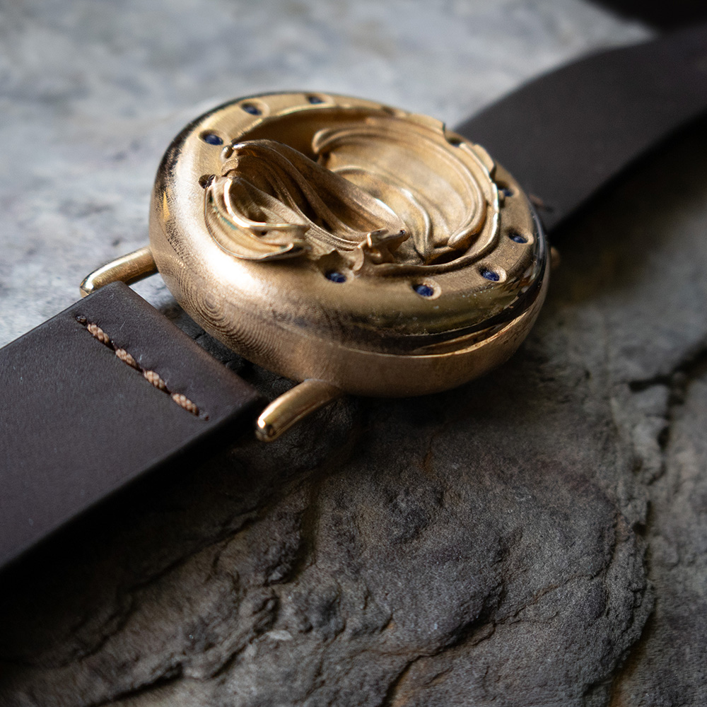
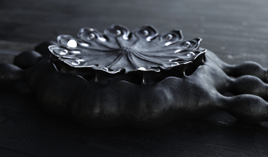
Here are a few of our very unique watch creations, so you can get an idea of the brand and what it’s about:

Our slogan is “A Synergy of Art and Time”, because our brand genuinely meets the generally-agreed definitions of art (unlike any other watch brand we are aware of), combined with the ancient 12-point horological concept.
If you are interested in our expanding range of watches, make sure you don’t miss our launch: subscribe for notifications.
The brand concepts include being arguably the first microbrand to be based on chosen aesthetics rather than the influences of mechanical functionality and fine jewellery, as well as being obviously very individual and unusually creative.
After brainstorming lots of options, my original logo used two images of sticks to form the “T”, combining organic forms with precision:
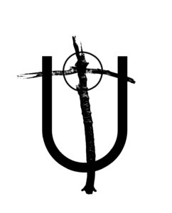
Coming back to the project recently, I wanted to change the logo, feeling that it needed something stronger, and a design which expressed the artistic focus of the brand more directly.
I experimented with some options, liking the use of brush strokes to represent the free-form creative nature and uniqueness of the brand. I eventually settled on our current logo, using a couple of painted brush-strokes for the “T” in combination with the simple typographic precision of the letter “U”, with serifs from one of the free fonts similar to Times New Roman which I welded to the top ends of the simple “U” shape.
Also, like most artists, I tend to distort objects slightly according to my own body shape which is tall and thin. So after I’d made the initial version, I saw that I needed to make it a little shorter and fatter, for a more ideal aesthetic balance.
I created our logo in Inkscape (which is free open-source vector software) . . . for those new to graphic design, a logo should always be defined in a vector format (not bitmap), so that it can be scaled to any size without losing quality.
I decided to trademark the logo as just the shape (registering a separate trademark for the business name), without any colour, so I could use it in any colour as needed . . . I knew I wanted to be able to use it in either black or white, to make it easy to overlay on various coloured backgrounds. At the time of writing this article I’ve not used it in any other colours, although I have added a subtle drop-shadow for some uses, especially where it might be seen at a relatively large size:
If you find our watches interesting . . .
Don’t miss our launch!
. . . make sure you subscribe for notifications for early access to our small, numbered releases, exclusive creator insights, and behind-the-scenes glimpses of our artistic process before they’re shared anywhere else.
What do you think of our logo? Let us know your thoughts in the comments below, or on our social media.
Author: Chris Melchior

This article was authored by Chris Melchior, founder of UnconstrainedTime and creator of the original range of wrist-worn sculptures of this unique artistic adventure.
Chris has extensive knowledge and experience of creativity, including fine art and cutting-edge contemporary music composition, and was awarded a First Class Honours Degree in fine art and music, with a minor in philosophy, from a leading UK University.
Chris’s life-long artistic obsessions include organic forms and textures, abstraction, fractals, and the aesthetic essence of musical genres.
He has developed unusually deep insights into the elemental concepts underlying areas including Eastern and Western philosophies, science and technology, creativity and the arts, as well as advanced empirical spirituality in which he is acknowledged as a leading authority.
He has a profound fascination and love for the unique and synergistically creative combination of fine art with the ancient essence of time-keeping which evolved into the UnconstrainedTime project.
(Any company logos, other than our own, used on our website are not owned by us, and do not imply any relationship with that brand).
Leave a Reply